The Southeastern Pennsylvania Transit Authority has released the newest version of their mobile application, version 3.0 for both Android and iOS, a massive overhaul of the applications design and functionality. Unfortunately, this update does little more than illustrate a major problem in the technology industry: companies updating their user interface at the cost of user experience.
Previous to version 3.0, the SEPTA app was far from devoid of bugs. The app was often extremely slow, showed incorrect live status information and featured a “Keep Me Logged In” button that was effectively pointless. In their newest version, they have neglected to fix any of these issues, and in some cases, have made these problems worse. Instead, SEPTA unveiled essentially a fresh new paint job on a somewhat less functional app to better resemble their competitor, Transit.
Transit, a community-based transportation information platform, uses user data to provide incredibly accurate route tracking information. They display all nearby routes and allow users to plan quick trips based on what is nearby, with the ability to save frequent destinations for work and home. Once a user selects a route, Transit will show them when to leave their current location to arrive on time as well as allow the user to opt in for voice commands to arrive on time. However, Transit does hide some of their functionality behind a paywall, allowing users to only access the six closest routes to the user’s current location without paying for a premium subscription.
SEPTA quickly realized that Transit was doing something right, and rather than delve into what people actually prefer about the Transit app, decided to copy the entire design without the most important part: the user data. Transit was not skyrocketing in popularity because it looked a little cleaner, but because it was far more accurate. Despite buses having tracking capability, the SEPTA app is often wrong or unsure about where the buses are or if they are even coming at all.
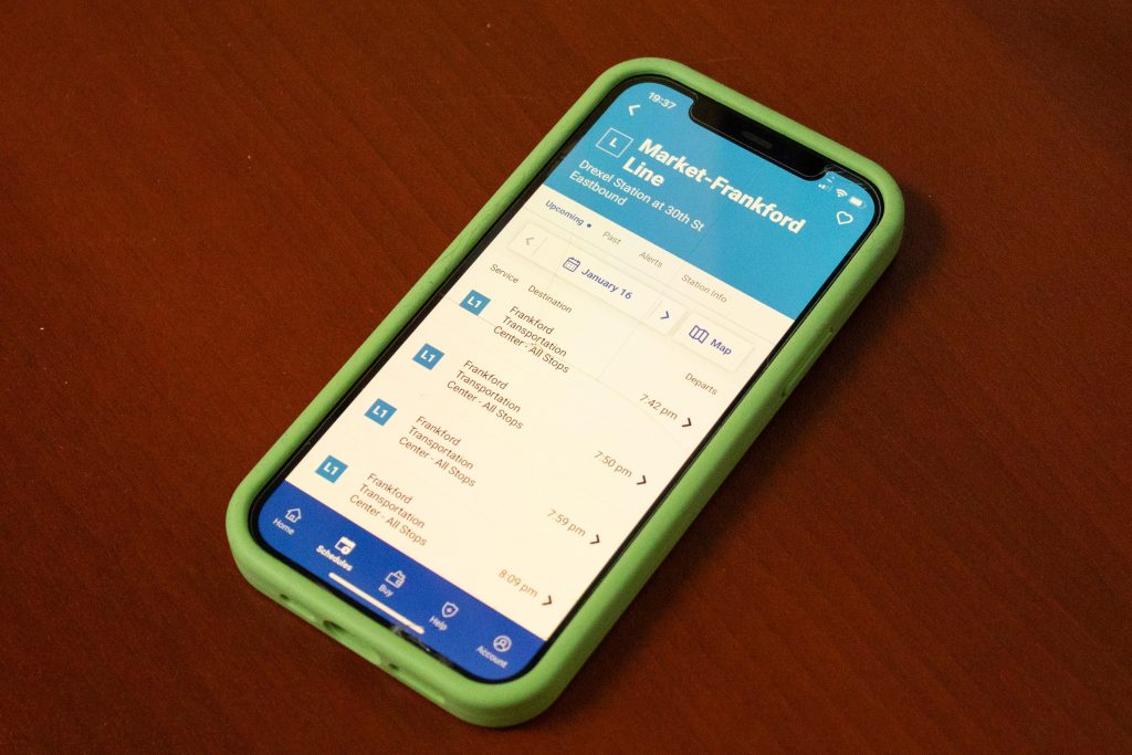
Upon opening the new app, SEPTA increased their load time with a long animation displaying only their logo, making opening the app in a hurry even more frustrating. The worst of the updates however is in the redesigned “Schedules” tab. Following their latest rebrand, SEPTA has changed their app structure to list “Metro” as a single entity as opposed to individual tabs for the subway, trolley and Norristown High Speed Line.
Once a transportation method and route are selected, the user has to input which direction they are travelling, their starting point and their end destination. In earlier versions of the app, the directions were labeled with the final stop of the route, such as “to City Hall”, reflecting how route information appears at stops and on the buses and trains. Instead, the app now gives the user options like “inbound” or ”outbound” for the regional rail or cardinal directions like “northbound” or “southbound” for the metro.
The app still requires users to select both a start and end stop, but does not allow users to search and has removed the filter from the destination list after the user selects their starting stop. This means users will have to scroll through incredibly long routes to find their destination stop, scrolling past many stops that are before their starting stop they just selected. The app also still has no way to remove expired cards. Why do the SEPTA key cards expire in the first place?
SEPTA’s new app looks much more aesthetically pleasing than the old one at the cost of much-needed functionality improvements. The field of technology is all about making updates and finding newer, better ways to create. Unfortunately, there is a recent trend of updates for the sake of updates. Change is great, but only if there is a strong, user-centric reason behind it.